
Introduction
Love Cards are a feature that was initiated as a forum or communication tool between couples to understand each other.
My role
I contributed to all the design processes, starting from benchmarking, creative user flow, wireframes, Low Fidelity design, High Fidelity, Annotations for hand-offs, and prototypes so that you can imagine what the flow of this feature is like.
Project scrope
Translating the PRD initiative from the CEO with a high-fidelity design that can be understood by Developers for the Love Card initiative.
Team
CEO, Project Manager, 2 UI/UX desingers
Duration
2 weeks (Remote) without user testing stages.
Tools
Figma: wireframe, high-fidelity design, prototyping
Google Meet: discussion, weekly update, and sync
Rock Chat App: Daily Updates
Background
Many couples don't know each other deeply. Even though they have been around for years, they often don't understand what their partner wants and miscommunication often occurs.
bicarakan.id as a consulting service platform with psychologists, sees this as a very important bridge. Often users who consult with psychologists express problems related to their partners and their relations lives. The key to this problem is hampered communication .
As one way to bridge this problem, we have the initiative to add a feature to the independent.id application. A feature that functions as a communication forum for partners to understand each other.
Who is experienced
Users who are of productive age and have relationships with other people, at the beginning of this initiative we are focused on early ads who started having relationshound the age of 18-40 years. Periods of physical and psychological changes that accomplany reduced reproductive ability (Hurlock, 2009)
At this age, people learn to have more serious relationships, try to community, and understand each other.
Why is this issue important
Communication is important for everyone to understand the goals of the person they are talking to. However, communication is often hampered by various conditions, where:
Don't know what to talk about
One of the interlocutors did not listen well
Misinterpreting the meaning of the source
With this problem, we hoped that the Love Card initiative can become a forum or tool that can help users to start communicating well to understand their partners.
How Might We
From this communication issues and the Love Card initiative, the next question is:
"How can we help users understand their partners more deeply?"
How Might We
From this communication issues and the Love Card initiative, the next question is:
"How can we help users understand their partners more deeply?"
Goals & Strategy
The objectives of this initiative are divided into general aspects:
From the user side, we want to help users use features that are easy to use and can help solve communication problems between couples
From a marketing perspective, we want to attraction new users to use the chat application with the latest features in the form of treatment in the form of fun gamification
From the business side, we want to increase the number of users and the duration of users using the Talk application
Documentation Process
Research and benchmarks
When I got the PRD (Product Request Document) with the 'Love Card' initiative, the question that came to my head was "Huh, what is this Love Card? A card that can make people fall in love? ” and it turns out to be true 🙂
I have seen and quite participated in card games that are similar in use to Love Cards, but in physical form, one of which can be seen in this Cut video:
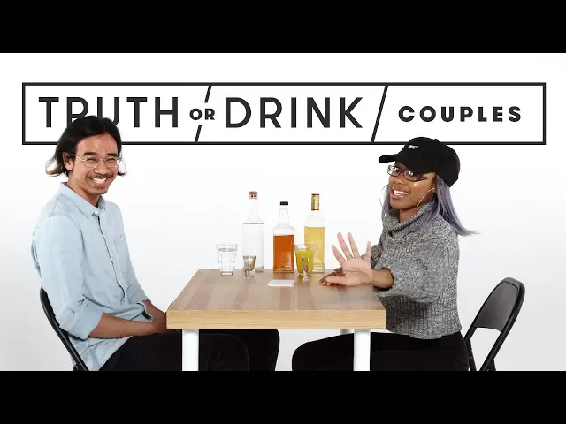
A game played by lovers, husband and wife, and various relationships using 'question cards' can create conversations that have never been had before before.
At the benchmarking stage, we used this physical card gaming reference as one of the features we highlighted. Some card design references that we have collected include:

I see that designs that use a blank background color are easier to read than a color, non-contrasting background color.
I see that designs that use a blank background color are easier to read than a color, non-contrasting background color.
Userflow
This userflow stage was treated to help our collaboration as UI/UX designers find out the position of entry point to end point from using the Love Card feature. What steps do users have to go through to complete this game, what is needed, and what will the user get?
Userflow
This userflow stage was treated to help our collaboration as UI/UX designers find out the position of entry point to end point from using the Love Card feature. What steps do users have to go through to complete this game, what is needed, and what will the user get?

Low Fidelity design preparation
After knowing the user flow, we made a rough design (low fidelity design) as a discussion guide between the team and also the CEO who requested this feature.
From this lo-Fi design we agree that:
Doesn't need to add a new section on the home screen page, and only adds a new banner card in the swipe banner area.
Users need a first tutorial on how to play Love Cards
Users need to know how many games levels there are
Users need a challenge if their partner doesn't want to answer, so that this game is more engaging
Game time can be set flexibly by the user

High Fidelity design
At this high fidelity design stage, we begin to explore what colors suit the brand we are talking about and then adjusting to user needs, such as:
We still maintain blue as the primary button color so that users immediately understand that the rounded rectangular shape in blue is a 'button'
We use red on the timer which functions as a highlight of the limited playing time on each card

Takeaways Project
The features of this stage only reach the idea stage, where we have not had time to carry out user testing on the design we are proposed due to time constraints.
However, I learned that design system was the most important thing in this project and helped our team of 2 UI/UX designers work quickly and get UI results that we uniform to each other.
Related posts
Aug 2023
The Future of UX: Embracing AI and Machine Learning
In the ever-evolving landscape of technology, AI and machine learning have emerged as pivotal elements in shaping the future of UI/UX design.

Aug 2023
The Future of UX: Embracing AI and Machine Learning
In the ever-evolving landscape of technology, AI and machine learning have emerged as pivotal elements in shaping the future of UI/UX design.
Mar 2023
Designing for Accessibility: A UI/UX Designer's Guide
Accessibility in design is not just a trend or a regulatory checkbox; it's a fundamental aspect of creating inclusive digital experiences.

Mar 2023
Designing for Accessibility: A UI/UX Designer's Guide
Accessibility in design is not just a trend or a regulatory checkbox; it's a fundamental aspect of creating inclusive digital experiences.
Feb 2023
Minimalism in UI Design: More Than Just Aesthetics
The minimalist approach in UI design is often celebrated for its clean lines and uncluttered spaces, but it embodies much more than just a visual style.

Feb 2023
Minimalism in UI Design: More Than Just Aesthetics
The minimalist approach in UI design is often celebrated for its clean lines and uncluttered spaces, but it embodies much more than just a visual style.