#web
#Figma
#designsystem


Figma
Figjam
Process
Research and Benchmarks
If you look at the competitors of bicarakan.id in Indonesia, there are not many websites that specifically have special programs for couple counseling. On average, experts are involved in all aspects of the problem which are then categorized according to the user's needs when consulting.
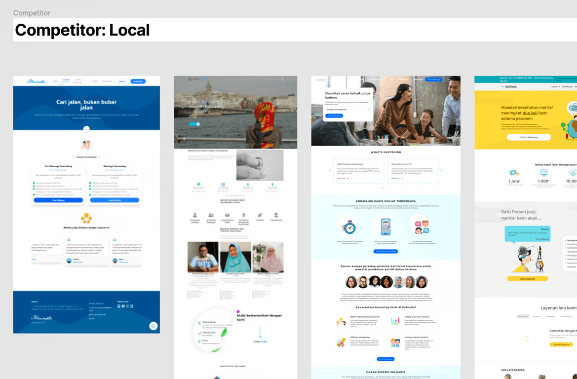
If you look at competitors globally, there are many psychology services that focus on couple counseling. This is an important issue in maintaining the relationship between partners.
If you look at all the competitors' pages, they show access to counseling, photos of psychologists who have experience dealing with couples' problems, user testimonials, and also what benefits users get.

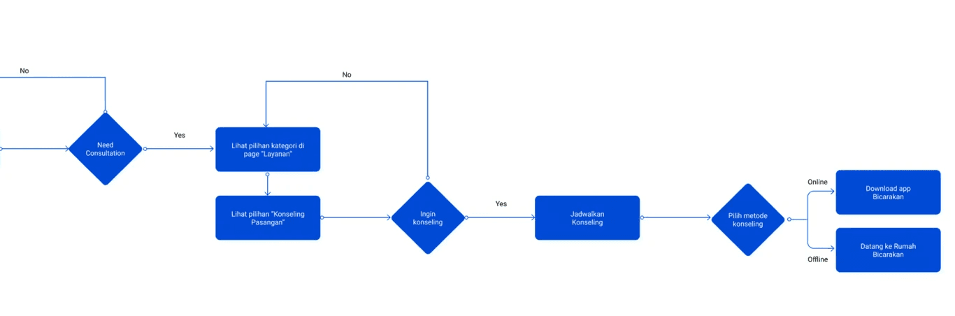
Userflow
This userflow stage was created to help our collaboration as UI/UX designers to know the position of the entry point to the end point of using the Couple Counseling service.
Estimating the flow so that users know more about the features of this service and how to get the service.
Low Fidelity design preparation
After knowing the user flow, we made a rough design (low fidelity design) as a discussion guide between the team. What information do we need to show on this page so that users understand that this service can help with the various problems they are facing.
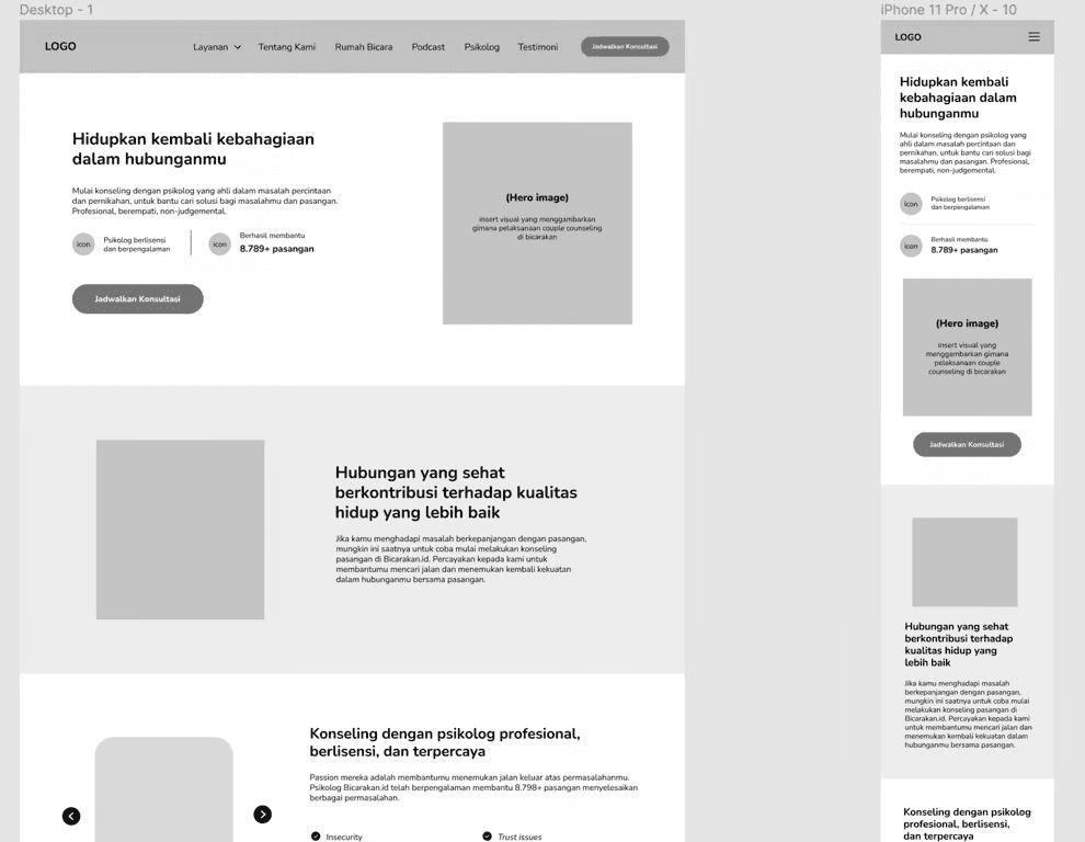
High Fidelity design
At this high fidelity design stage, we began to explore what components and colors were appropriate to the bicarakan.id brand and then adjusted to user needs, such as:
We still maintain blue as the primary button color so that users immediately understand that the rounded rectangle shape in blue is a 'button'
We use yellow for the sticky FAB (Floacting action button) so that it is easy to reach for users who are interested in consulting
We use rounded images on each image to give a non-stuffy impression, so that users feel comfortable using the services of merdeka.id

Conclusion
The features of this stage only reach the ideation stage, where we have not had time to carry out user testing on the design we proposed due to time constraints.
However, I learned that the system design for websites is different from that for mobile apps. Different in terms of font size and also the colors chosen. We as UI/UX designers also need to provide designs with various view port sizes, whether desktop, tablet or mobile view.

