#dashboard
#Figma
#designsystem


Figma
Figjam
Loom
Process
Research and Benchmarks
After determining what focus would be improved on this student dashboard, I then thought of an efficient strategy for carrying out this task within a period of 3 days. The strategy I use is:
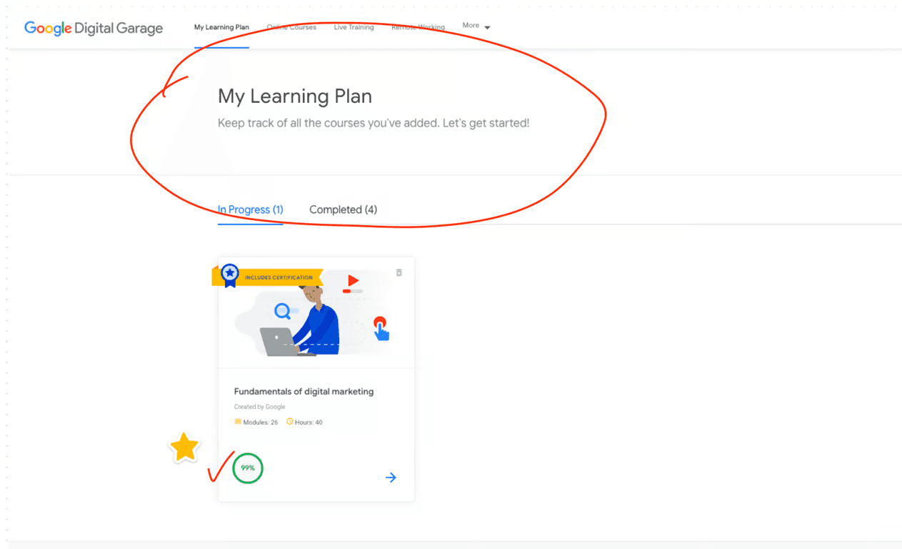
From Google Digital Garage, as a student I feel helped by the progress of my learning in the classes I take when I enter the dashboard.
Judging from Udemy, students will see a history of which learning videos they have watched and the duration of each video.

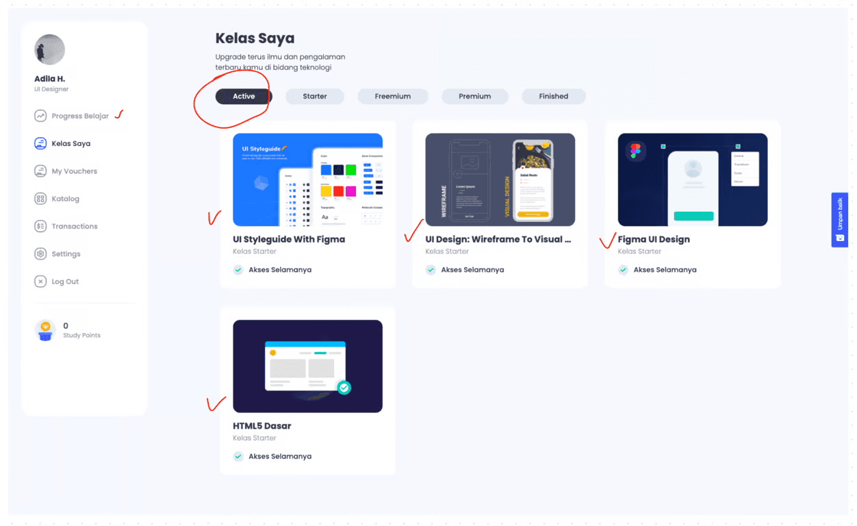
In the BuildwithAngga class dashboard, I can see which classes I have taken and they are even divided into several categories, such as: Active, Starter, Freemium, Premium and Finished.
They also provide #RoadmaptoFuture, where students can find out what classes they need to take when students want to change their career to a certain job, for example a student wants to have a career in the field of UI Designer, the student can choose the Roadmap 'Become User Interface Designer'.

In each discussion there is also an indicator of the difficulty level of each class - whether this class is suitable for beginner or advanced level. The details of each class are very easy for students to access. Students can directly access it by pressing the tab feature below the learning video.

From this dashboard, as a user, I was greatly helped by:
The 'upcoming classes' schedule is clearly visible and detailed
There is a progress bar in the form of a chart that shows how long the user has studied the class they are taking per day
There is an overview feature where users can see a summary of their activities on the dashboard
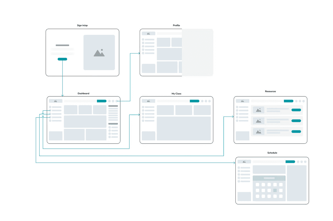
Sitemap
This sitemap functions as a determinant of what content is needed on each page in the Student Dashboard. Apart from that, this sitemap can also help the Developer team in developing this product later.

Userflow
From the Sitemap, I then translated it into userflow with the use case of a student taking one of the classes (example: Data Science) - then the student can see all the information on the main Dashboard page and can access the class directly without having to open it in another menu.

Wireframes
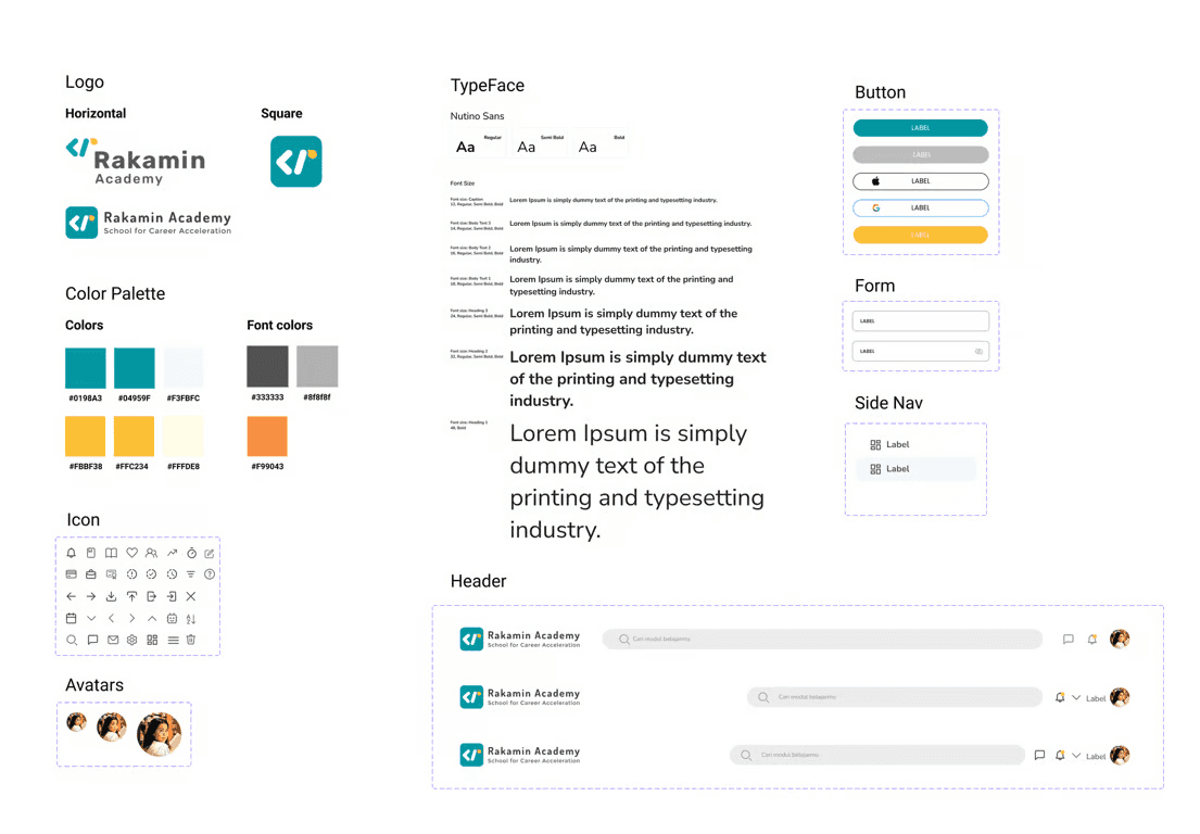
After finishing determining the sitemap and user flow of the Student Dashboard, I then made a rough sketch in the form of a wireframe to estimate what visual asset needs I would need later in the High Fidelity stage.

From this wireframe, I see that I will need several assets in the design system later:
Logos
Icon
Buttons
Image
Search bar
Side menu
Menu headers
Schedule
On boarding page
Wireflow
From the user flow and wireframe that has been created previously, the approximate prototype flow that will be produced will be like the image below:
High Fidelity design
After detailing what I needed to create a High Fidelity Design, which can be seen in the previous wireframe stage, I created the assets in the following Design System:
After finishing creating the visual assets and using them as the design system for this challenge, I easily used these assets in the process of creating the Student Dashboard - by using a drag and drop system on the 1440x900 frame and quickly created a high fidelity design which can be seen in the following ideation results:
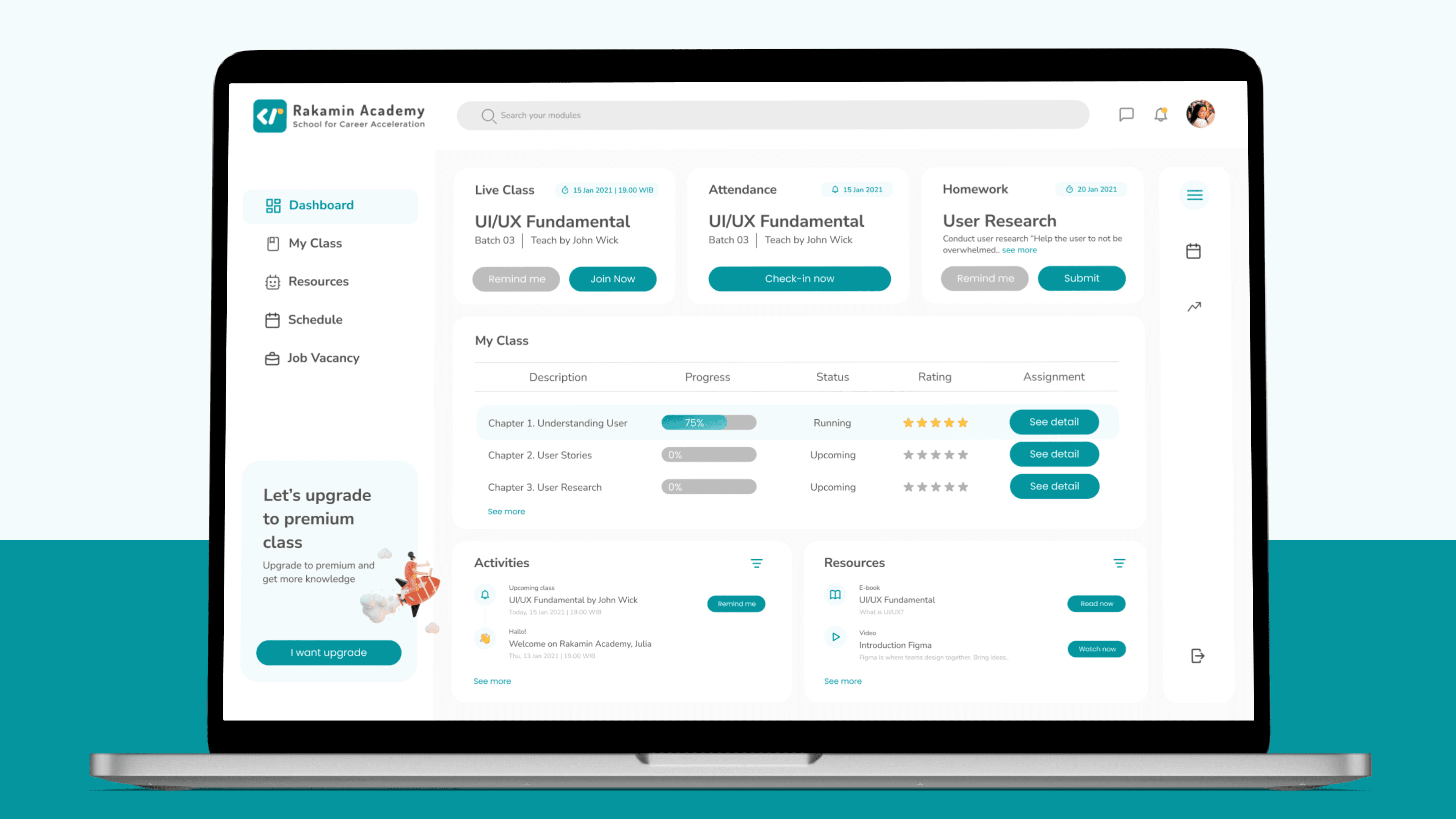
Display of the Student Dashboard main page
On this main page, students can directly access Live Class by pressing the 'Join Now' button or creating a reminder at the previous hour so they don't miss the live class. Apart from that, students can fill in their attendance by accessing the 'check-in now' button, and find out which assignments must be done first.

My Class page
The 'My Class' page is almost similar to the main page, but is different in that it recommends other classes that suit student needs. On the other hand, I admit that there are no other ideas for optimizing this page due to time constraints.

Resources page
This 'Resources' page contains supporting materials that students can study.

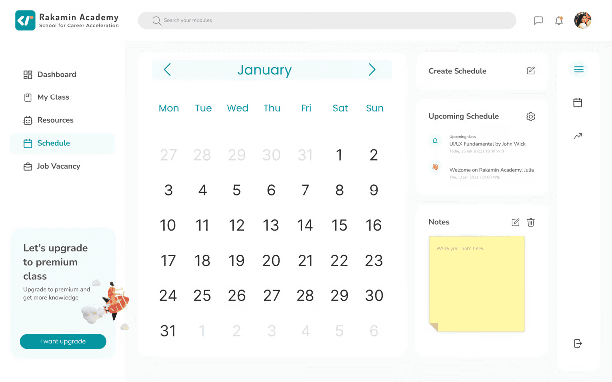
Schedule page
This 'Schedule' page can be used by students to access class schedules, create reminders or notes.
Job Vacancy page
Apart from that, there is a bonus page where students can access available job vacancies according to the field they are studying. As a student and career shifter too, this page will be very useful in my opinion, because it will increase my enthusiasm for learning and completing the assignments given in class so that I can immediately apply for existing jobs.

Impact
The design challenge that I took part in lasted 3 days during which I was unable to carry out the usability test stage on users. Even though it seems biased, as a user who has attended several bootcamps, I think the main page with several shortcut features that I developed in this design challenge will help me access the features I need as quickly as possible.
Conclusion
From this design challenge I felt challenged to work on all stages of the design, even in the Binar Academy case study that I made, it required quite a long duration of work and was done as a team. However, in this challenge, I managed to do all the stages myself and in a shorter time duration.
The negative impact that I felt when doing this challenge for 3 days, there were several aspects that I couldn't do. For example, on the My Class page, where I had difficulty finding ideas for content to include on that page.
I realized that the process of producing a dashboard requires a lot of team participation and is not the work of just a single fighter UI/UX Designer. There are many things that need to be discussed again according to user needs and e-learning business interests.
Even though I didn't succeed in passing the design challenge given, the HR from this education startup was quite informative and provided the results of me not passing as a candidate after two weeks of me submitting this design challenge.
Hopefully this design challenge can be a reference for friends who need resources for a design challenge, are developing dashboards, or recruiters who are looking for UI/UX Designer candidates 🙂
Let me know if you have any questions!

